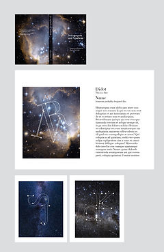
Logotype Book
This series was a project for my Typography I class, and consisted of two different parts- creating logotypes from 24 different typefaces, then creating a book that featured the logotypes.
For the full book, click here!
Part One: Logotypes
For the logotype section of this assignment, I combined two letters of the same size and font together in a way that creates a new design while keeping the original letter forms recognizable. Each of the 24 logotypes was made from a different typeface. When creating the logotypes, it was important to identify where both letters shared a similar line, both in weight and shape. The purpose was to look closely at the forms of different typefaces and understand how they relate to one another.
Final Logotypes

Drafts


Part Two: Designing the Book
The next step of the project was to design a book that showcased my designs and investigates the different typefaces used to make them. For a theme, I considered space or geometric patterns, but ultimately decided to feature different places that I have visited around the world. All the pictures were taken by either me or my friends, which helped make the project that much more personal to me.
Final Theme


Brainstorming Theme Ideas


